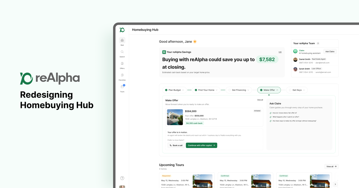

Turning a homebuyer-only dashboard into a unified, personalized hub for realty, mortgage, and dual-service customers.
| Role | Design Lead (sole designer) |
| Company | reAlpha |
| Team | Product Manager, Tech Lead, Designer (me), Developers, QA |
| Timeline | 4 sprint cycles (each: 3 weeks active + 1 week cooldown) |
| Status | Live |
| Tools | Figma, Banani, Figma Make, Lovable, Linear, Parabol |
| My scope | Process ownership, discovery, wireframes → hi-fi, design review facilitation — as sole designer on the project |
The Problem
reAlpha already had a homebuying dashboard, but it had three structural problems:
- It only worked for one kind of buyer. reAlpha offers both realty and mortgage services, and which services are available depends on the buyer's state. But the dashboard was built as if every buyer was a realty-only homebuyer — it didn't account for mortgage-only customers, or customers using both services in states where we support both. Buyers were left navigating an experience that didn't reflect their actual journey. The mortgage customers were handled separately in another CRM (GoHighLevel) by the Loan Officers.
- We had no idea if it was working. There was no retention model and no real product analytics behind it, so the team was designing and shipping without a feedback loop. We didn't know where buyers were dropping off or what "progress" even meant to them.
- Customers had no idea where they were in their homebuying journey and what they needed to do. Homebuying is a very long process, and one of the key decisions people make in their life. reAlpha relied mostly on human agents talking with the potential buyers but app didn't holistically captured customer's journey.
On top of the product problem, there was a process problem: this was the first project our team ran as a proper sprint as we migrated from Notion to Linear. The team hadn't worked in a formal agile process before, which meant the redesign had to happen while we were also building the muscle to work this way.
My Role
I was the Design Lead on this project — and the sole designer, so everything from early wireframes through final hi-fi and design review was mine end to end. On top of that, I owned the process itself.
Because this was the team's first sprint-based project and nobody besides me had worked in a formal agile process before, I wrote a Product Development Framework, drawing on prior experience running sprints — the lifecycle stages (PRD → kickoff → feasibility → design sprint → design review → requirements lock → sprint planning → implementation → QA → release → post-launch review), the sprint cadence, role definitions, and review checkpoints. I then reviewed and refined it with the PM and Tech Lead before it became the team's working model. Without it, "design one sprint ahead of dev" was just an idea, not something the team could actually execute against. And the design sprint ran 1 sprint ahead of engineering one.
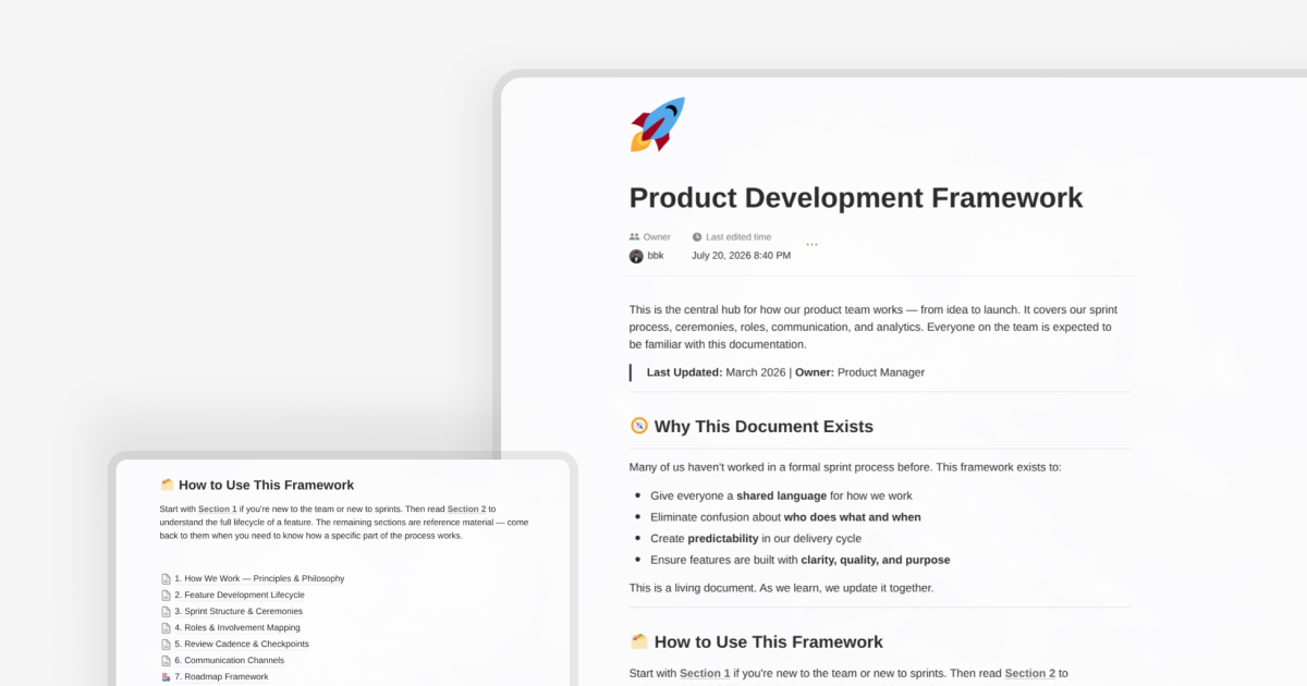
Writing the framework was only step one — the team still had to learn to work this way. The team ran a walkthrough so they could get used to with the new project tacker, and I personally led sprint retro using Parabol for the first several cycles to get the team comfortable with the ceremony itself: what a retro is for, how to surface real friction instead of just listing tasks, how to leave with actual action items instead of a vague "went fine."
I bring this up in a design case study deliberately: a big part of leading design at an early-stage product org isn't just the pixels — it's building the scaffolding that lets design work land predictably, and then supporting the team through actually using it.
Discovery
The PM led user interviews to understand where buyers were getting stuck in the current dashboard, and used those insights alongside her own exploratory prototypes (built quickly in Lovable) to communicate an early vision for the redesign to the team. From there, we ran a joint discovery and feasibility session with the PM and Tech Lead to pressure-test scope against engineering constraints before any design work started — in line with the "requirements lock after feasibility" principle I'd just written into the framework.
What came out of discovery reframed the problem: this wasn't a cosmetic redesign, it was a personalization and information architecture problem. The hub needed to flex based on:
- Which services the buyer actually has access to (state-gated realty, mortgage, or both)
- Where they are in a 5-stage homebuying journey (Plan Budget → Find Your Home → Get Financing → Make Offer → Close)
- What they should do right now, not everything they could possibly do
Key Design Decisions
1. Personalized by service eligibility, not one-size-fits-all
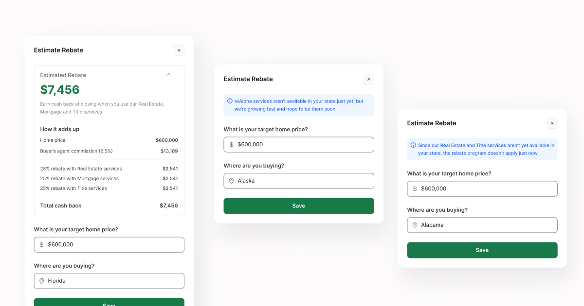
The hub had to render three real versions of itself: realty-only, mortgage-only, and combined. A mortgage-only buyer in a non-rebate state shouldn't see a rebate progress bar or listings search; a dual-service buyer should see both tracks converge. This meant designing the layout system around state/eligibility as a variable from the start, not bolting personalization on later. And there were cases where one or more services were not available in their states.
2. A journey that's both a map and a place to focus
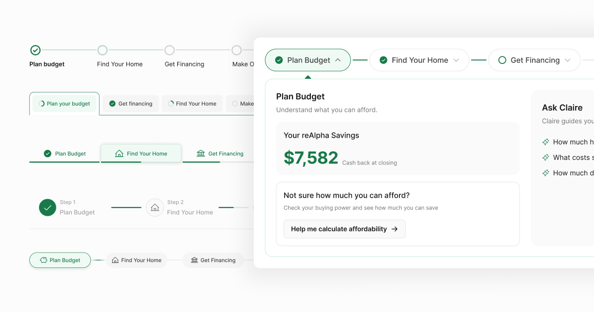
With 5 stages in the homebuying journey, we needed buyers to see the whole path and focus on one stage at a time (so it doesn't feel overwhelming). Those are somewhat competing needs — a pure timeline is great for orientation but bad for focus; a pure tab pattern is great for focus but hides the bigger picture.
This was the hardest interaction design problem on the project. I explored multiple variations of a hybrid pattern — a timeline for overview plus tabs for depth — using Banani and Figma Make to iterate through options quickly, though the AI-generated variants needed real hand-tuning before they actually worked together as one coherent pattern. We landed on one version after review; screens for the chosen pattern and the rejected variants below.
4. Human and AI expert access, always one tap away
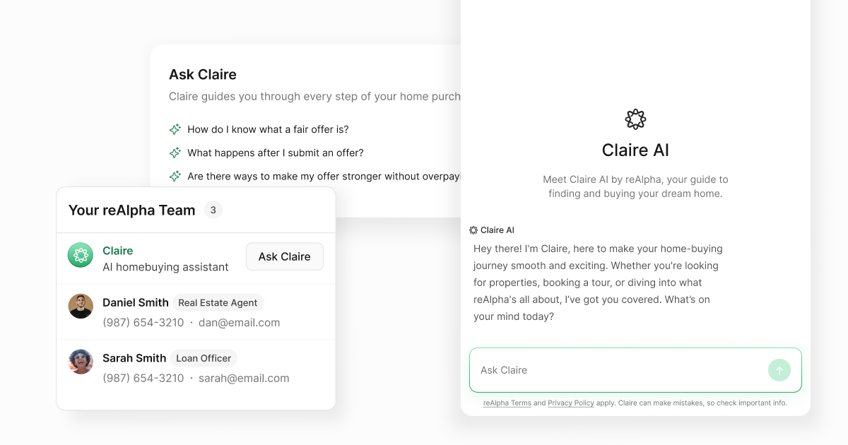
We designed a persistent "My reAlpha Team" section giving buyers quick access to both their real agent/loan officer and an AI copilot ("Ask Claire") for lighter-weight, always-available help. AI-FAQ integration gives buyers a fast entry point to Claire.
Process
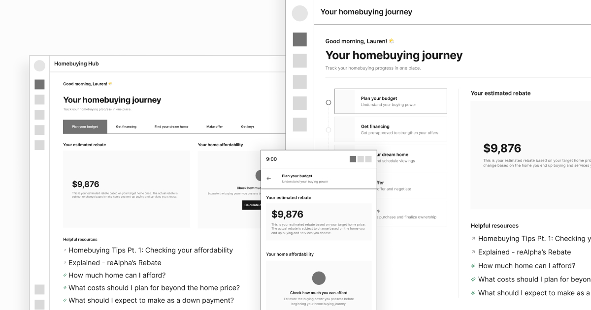
- Wireframes & lo-fi in Figma, working through the layout logic for the three eligibility states before committing to hi-fi
- Used AI-assisted design tooling (Banani, Figma Make) to accelerate iteration speed on early concepts and variant exploration, so review cycles could focus on decisions rather than production
- Periodic design reviews with the PM (and Tech Lead as needed) to keep design tracking against the locked requirements and catch feasibility issues early, rather than at handoff
Challenges
- Building the plane while flying it. Introducing sprint discipline and a design review cadence to a team that had never worked this way, at the same time as redesigning a live product surface, meant I had to keep the framework itself lightweight enough not to slow the actual design work down.
- Abstracting complex homebuying journey into seamless homebuying journey UX.. Buying a home in the US is a very complex and a long journey involving multiple people (agents) and tools. It was challenging to find the perfect blend of minimal UX while still making sure customer understands where they are and what they need to do next.
- No existing analytics baseline. Because there was no retention/product analytics setup before this, we couldn't design purely from data — discovery leaned more heavily on PM-led interviews and my own judgment about where friction lived in the existing flows.
- People don't trust AI in life-decision like buying a home.. We had to carefully curate AI touchpoints through AI FAQs and "Your Team" section.
Defining Success
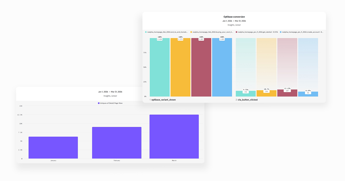
Since retention and product analytics weren't previously in place, defining measurable success was part of this redesign, not an afterthought. The metrics we designed toward:
- Multi-service engagement — % of qualified leads active in both real estate and mortgage CRMs (previously only 3–5%)
- Active users — % of registered customers returning within a rolling 30 days
- Engaged users — next-step CTA starts and stage completions per user, per month
Results
reAlpha is pivoting to mortgage industry and acquisition of Prevu (Real Estate) and InstaMortgage has distributed the actual customer data across multiple platforms.
Reflection
Simplifying homebuying journey is a challenging task that even the real estate giants like Zillow and Rocket have not been able to perfectly figure out and with AI-driven workflows, its usually a trust issues with people when it comes to life-decision like buying a home. Buyer always prefer to talk with the actual human agent than to just chat with AI hoping it understands what they are looking for. And introducing subtle AI-touchpoints like "Your Team" and "Ask Claire" section on each journey meant buyer always had human + AI by their side.
Appendix: Terms Used
- MQL / SQL — Marketing Qualified Lead / Sales Qualified Lead. Standard lead-scoring tiers indicating how far along a buyer is toward being ready to work with an agent or loan officer.
- Rebate — Cash back reAlpha offers buyers at closing in supported states when they buy home through reAlpha, used as a core motivator throughout the funnel.
- Buyer agreement — A signed agreement required before an agent can formally represent a buyer; a legal/compliance gate in the offer flow.
- CRM (GoHighLevel) — The system agents and loan officers use to manage leads and communicate with buyers outside the product itself.
- Hi-fi / Lo-fi — High-fidelity (polished, near-final visual) vs. low-fidelity (rough, structural) design artifacts.
- PRD — Product Requirements Document; the spec that defines a feature's problem, goals, scope, and success metrics before design or engineering begins.
- Sprint / cycle — A fixed time-boxed period (here, 3 active weeks + 1 cooldown week) in which the team commits to and delivers a defined set of work.
- Linear — Issue-tracking tool used to manage design and development tasks.
- Parabol — Tool used to run structured sprint retrospectives.
- Feasibility assessment — The engineering review stage where a locked PRD is checked for technical viability before design work is finalized.