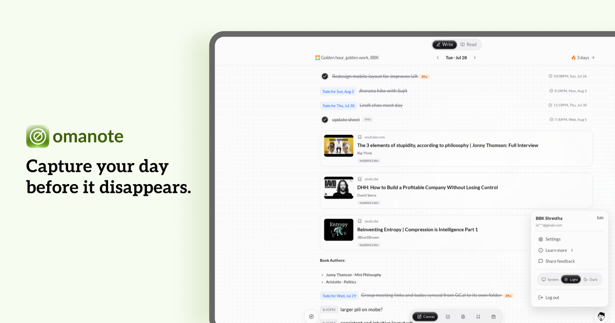
One founder, one canvas, four months. I was stitching together four different tools to run my day. Instead of adopting a fifth, I designed and built my own — then used it as a live test of how far AI coding tools can carry someone who already has the design taste and the architecture decisions fully formed.
| Role | Founder, sole designer & builder |
| Timeline | ~4 months (first commit mid-April 2026) |
| Version | Beta, v0.31.2 |
| Stack | React, Convex, Clerk |
| Tools | Claude Code, Cursor, OpenCode,Codex, Figma |
| Status | Live, small user base, actively instrumented for product-market fit — not yet marketed publicly |
| Website | omanote.com |
TL;DR
- I was stitching together Slack, Capacities, GCal, and browser bookmarks just to run my day — and used building my own tool as a deliberate test of how far AI coding agents could carry execution when the design taste and decisions are already mine.
- End-to-end encryption was a first-principles decision, not a checkbox — and it became a hard constraint that reshaped how recurring todos, local-first sync, and collaboration had to work (or, in collaboration's case, not work yet).
- Two real user incidents directly changed the product — a friend got locked out after a recovery-key login (same-cycle fix), and repeated evidence that people don't read changelogs, which is why onboarding and the feedback modal exist.
- I haven't marketed this publicly. Instead I built myself an admin dashboard specifically designed to catch me lying to myself about traction — including a metric that flags when my own usage is skewing my read of the product.
The problem
I run my day across too many surfaces: Slack for reminders, Capacities for notes, a calendar app for events, browser bookmarks and texts-to-self for things to read later. None of these tools are individually wrong and probably there are apps out there that does everything I've wanted.
But I didn't go looking for a fifth tool that does all of this. I built one.
There was a second motive, and I want to be upfront about it rather than let it read as an afterthought: I wanted to find out how far AI coding tools could carry someone who already has the design vision and the decisions fully formed. Not "can AI design and build an app" — a question I don't find that interesting — but "if I bring the taste and the judgment myself, how much of the execution can AI genuinely take off my hands?" omanote is the answer to both questions at once.
In the age of AI, I believe you'd rather build a tool to solve your problem than search for other's
And honestly, this wasn't a market problem I went looking to solve. It was my problem, with an explicit bet behind it: if it worked for me, it might work for the people who share the same problem. That's the philosophy Jason Fried and DHH built Basecamp on — fix your own itch, and the people who have it too will pay for it. I'm borrowing the philosophy on purpose, not pretending I invented it.
Process — from Figma to a real backend
The same process repeated across nearly every feature, not just the initial build — design judgment first, AI execution second, always in that order. Here's what my initial Figma mockup looked like:
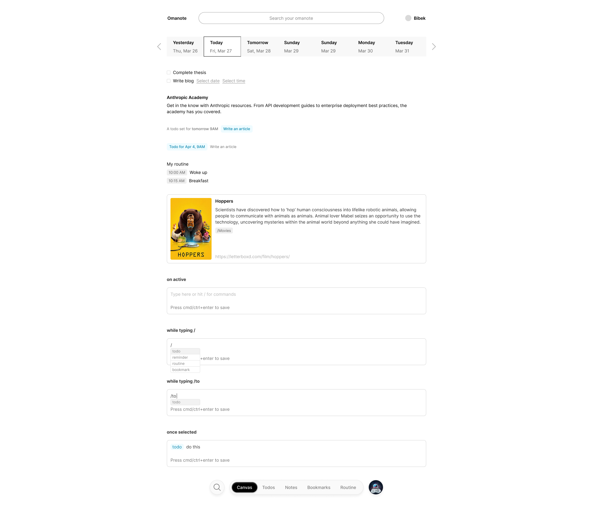
- Design in Figma where design actually needed to happen — not every screen. I designed the layout system, input patterns, and custom components that are hard to describe in words and easy to get wrong from a prompt — the chrome pill used for nav and tabs is the clearest example. For a lot of screens, it was genuinely faster and more precise to explain the direction directly to an AI agent than to mock it up first; Figma was for the pieces where visual judgment had to happen in a visual tool.
- Feed that design direction into an AI coding agent to translate it into working code — Codex first, later Claude.
- As the app took shape, I built a proper token-driven design system instead of using Tailwind (which I am honestly not a fan of their naming convention). A few examples of the care that went into it: two semantic font tokens, where the serif choice (Aleo, replacing an earlier font, Literata) was picked specifically for a "sturdier, more grounded, note-taking-friendly feel and Lato as a sans serif font (my favorite these days).
Fun fact: Aleo is a contemporary typeface designed by Alessio Laiso as the slab serif companion to the Lato font by Łukasz Dziedzic
- Research existing products for inspiration — Notion, Capacities, Listy, Obsidian — to understand what "second brain" tools get right, before deciding omanote would deliberately not try to be a second brain at all.
- Write the reasoning down as I went — a real PRD and decision logs throughout the app's journey, a real systems architecture document, feature-specific specs (encryption, local-first sync, Google sync, mobile, RSS, browser extension), a pre-launch security review, and an implementation checklist mapping every PRD line to the file that satisfies it. This wasn't a generic "vibe-coded" app, it was agentic driven workflow with conscious decisions.
I also started building a visual token editor as a standalone tool to help me edit tokens and components without having to use AI-tokens but I shelved it once I noticed I was building a design tool for my design tool instead of finishing the actual product and I felt I was just wasting my time.
Naming it
Omakase (お任せ), Japanese for "I'll leave it to you" — the trust placed in a chef who just handles it, no menu, no decisions — plus note.
It's deliberately opinionated about structure, product taste and the mental model is fixed (one canvas to dump your day's activities), but theme, font, nav style, and shortcuts are configurable.
From the landing page:
"omanote does the same thing for your day. The structure is already there waiting... It's for people who want to just open a thing and start typing — not spend a weekend building a second brain."
Explicitly inspired by Omarchy, DHH's "beautifully stubborn, ready-to-use" Linux setup — same philosophy, applied to daily capture.
How I'd position it to a skeptic, honestly: if you're happy with what your current tools offer, keep using them. But if you want one place for your thoughts, tasks, links, and events, and you think in a "daily dumping" mindset rather than a "carefully filed second brain" mindset — omanote is worth trying. (This framing isn't on the landing page yet; writing this case study is what made me realize it should be.)
Key decisions (and the trade-offs behind them)
Decision 1 — End-to-end encryption, from day one
The trigger: the things people put into omanote are personal by nature — notes, todos, bookmarks, calendar events. As the person who owned the entire backend, I could technically read every row in that database.
The build: client-side AES-GCM-256 content encryption, per-user key wrapped via PBKDF2-SHA256 → AES-KW. Every content field is encrypted — todo titles/notes, note bodies/tags, bookmark URLs/titles/descriptions, event entries, checklist items, even folder and category names.
The trade-off I accepted on purpose: metadata isn't hidden (IDs, timestamps stay plaintext so the server can route and sync), and recovery is unforgiving by design — lose your passphrase and your recovery key, and the data is gone. No backdoor, because a backdoor defeats the point.
Reducing the risk of that unforgiving design, quietly: every time a passphrase is changed, the app doesn't just prompt you to save a new recovery key — it auto-downloads one immediately, unprompted, as a .txt file, the moment the passphrase changes (and again on every rotation). I designed it this way because asking someone to remember to manually re-download their recovery key after a security-sensitive action is exactly the kind of step people skip, and the cost of skipping it is total, permanent data loss.
This decision wasn't just a security feature — it became a hard architectural constraint that shaped recurring todos, local-first sync, and my call on real-time collaboration, below.
Security isn't a one-time architecture decision either — I treat it as a recurring practice. Periodically, I go through the whole app with an AI agent and asked it to refactor, optimize, and audit the codebase specifically for Product Hunt launch — not a one-off "does this look okay," but a structured pass looking for exactly the kind of thing that only shows up once real traffic hits a public product. That pass caught and fixed eight real issues before launch.
I keep coming back to two questions whenever I run this kind of pass, because they catch different classes of problem than "review this code": "Where does my app fail in the long run?" and "What am I assuming about how my product works that isn't actually true?" The first surfaces things that are fine today but degrade under scale or time — the second surfaces the blind spots that come specifically from being the one person who built the whole thing and therefore never hits it the way a stranger would. The second questions help me uncover decisions AI made on my behalf.
Decision 2 — Human language for todos
I have always love how Slack's "/remind me to complete a task at 5pm tomorrow" works. Inspired, I built similar human language into todos for date, time and recurring ones.
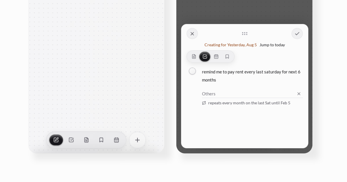
"every mon and fri" or "pay rent every month on the last saturday until December" or "drink water every 30 minutes for the next 6 hours"
— parsed via chrono-node plus a custom recurrence parser, with the underlying rule engine written as pure UTC day-number math specifically to be DST/timezone-proof, and a chip that confirms what omanote understood before you commit to it.
Decision 3 — Completing a todo is an event in your life, not a checkbox
Small detail, but it shows the level of care: when you complete a recurring todo, the label switches out of imperative form. "Buy groceries" becomes "Bought groceries" in your activity log — a small verb-conjugation engine, applied only against a whitelist of common imperative openers. Nobody would spec this. It's the difference between a todo list and something that reflects the actual shape of your day.
Decision 4 — No onboarding, until real usage proved it wrong
I built this for myself, so I didn't design onboarding — I already knew how it worked. Deliberate, build for the person who has the problem, ship it, let usage tell you what's actually confusing.
Two separate pieces of real user evidence eventually forced a change here:
- The changelog was invisible. I kept shipping real features — recurring todos, Google Calendar sync, an RSS reader — and documenting every one in the changelog. Almost nobody read it. People would dismiss the "what's new" surface and stay unaware of things that already existed.
- A friend got functionally locked out. Early on, if you signed in using your recovery key, the app just... let you in, with no forced follow-up. If you'd forgotten your passphrase, you'd sign in via recovery key, and the next time you needed to get back in, you'd need that same recovery key again — because nothing prompted you to set a new passphrase. One friend hit exactly this. I shipped the fix same-cycle: signing in via recovery key now forces you into a mandatory "set a new passphrase" screen before you can do anything else, and that in turn rotates and re-downloads a fresh recovery key automatically. I literally added "One grave mistake fixed." in the changelog for this update.
Both incidents pointed at the same underlying problem — a product that assumed users would notice and understand things the way I, the builder, naturally would. So I built:
- A five-step onboarding wizard (welcome → make it yours [theme/font/nav] → connect a few things [optional Google Calendar/RSS] → a pointer to the guide and feedback → passphrase, deliberately set last so setup friction doesn't hit before someone's seen the product). I considered a single-page setup screen first — it felt overwhelming with everything on one surface, so I split it to one decision per screen.
- A public guide site, accessible even signed out.
- An in-app feedback modal (not a persistent button — triggered from the bottom nav), with an anonymous option, rate-limited to keep responses meaningful rather than spammy.
- A founder's note that plays once, right after onboarding (added v0.21.0), in my own voice, explaining exactly why the product exist.
- The PMF dashboard described in section 5 — built for the same root reason: I can't fix what I don't have honest visibility into.
The lesson underneath all four of these: I'd been designing for someone who already understood the product, because that person was me. Real onboarding only got built once real users proved that assumption wrong.
Decision 5 — Todo folders, added after watching a friend's workaround
The earliest version of omanote had no folders for todos — notes and bookmarks already had them, todos didn't. Watching a friend use Google Tasks to build ad-hoc, context-specific task lists (a grocery list, an outing list) made the gap obvious: todos needed the same grouping notes and bookmarks already had. Shipped v0.24 (June 23, 2026), with sharing built in from the same release.
That feature then became something I didn't originally plan: omanote's own public roadmap is a shared todo folder with roadmap items tracked as todos and checked off as they ship. Using my own sharing feature to run the product's own roadmap is the kind of dogfooding I trust more than a demo.
What I considered and didn't build — and why
A case study that only shows what shipped is missing half the judgment. Here's what I looked at seriously and chose not to build, and why:
- Real-time collaborative folders. I wrote a full design proposal for this — invite-by-email, owner/editor roles, a revocable invite flow, all modeled out. I tried but didn't ship it, because encryption made it genuinely hard to do safely: every collaborator needs their own wrapped copy of the content key, and any membership change means re-wrapping and re-syncing keys across every device, on top of a system that's already local-first and offline-tolerant. This was before the current generation of AI coding models — I'm holding it until I can lean on a stronger model to help get the encryption-and-realtime-sync interaction right, rather than ship something fragile.
- Pomodoro as a feature. I considered it, even sketched it as a plugin-style addition. But recurring todos with natural-language repeats already cover most of what a Pomodoro timer is trying to do for me — "drink water every 30 minutes for the next 6 hours" is functionally a Pomodoro-style prompt. Didn't see a strong enough reason to build a parallel system.
- Image/attachment uploads. Still an open one. The data model isn't built for storing large binary content well right now, and I'm not going to bolt that on without doing it properly — most likely via Cloudflare R2 as the storage layer rather than pushing blobs through Convex. Held off deliberately rather than half-building it.
- Google Tasks integration, alongside Google Calendar. I actually evaluated and partially built toward this, then pulled it — Google's Tasks API is one-way (no push notifications, so no real two-way sync is possible) and date-only (no time-of-day field, even though Google's own apps show one). Building a second, permanently-degraded sync channel next to Calendar wasn't worth it: everything Tasks would cover, Calendar already covers better.
Challenges
Information hierarchy got genuinely harder as the surface area grew, and it never became a one-time decision. Canvas, todos, notes, bookmarks, events, RSS, Explore, Insights — deciding what belongs on the default canvas versus what deserves its own screen is a question I still revisit, not one I solved once. The mobile redesign (v0.28.0 — single "+" composer, floating drawers, long-press to edit) was a direct response to desktop information density simply not translating to a small screen.
Building a notetaking editor from scratch was the hardest technical stretch. Rich text editing has a huge edge-case surface, and I was maintaining my own for a while. I eventually migrated to TipTap (v0.20.0) rather than keep re-solving a mostly-solved problem — recognizing which parts of the product needed my original engineering effort and which parts didn't.
I still have a real, unresolved gap I notice myself running into: everything added lands on one canvas per day. There's no way to keep multiple separate dumping grounds for the same day — one for work, one for personal — without them colliding on the same surface. It's a case where the core simplicity of "one canvas" is also its current ceiling, and I haven't decided whether the fix is multiple canvases or something else that preserves the one-place-to-drop-everything feeling without fragmenting it back into separate apps — which would undercut the entire premise.
Small inconsistencies exist that I know about and haven't unified. The close ("X") button on the Settings page and the one on the Explore page are implemented through two different code paths with different positioning — Settings' close button sits alone, right-aligned, replacing the whole bottom nav; Explore's sits left-aligned, inline within the full nav bar next to the search field. Functionally fine, visually inconsistent. I know it's there; it's on the list, not yet fixed.
6. Design details worth zooming in on
A few smaller decisions that show the level of care, in case they come up:
- The canvas date strip — a decision I reversed once I actually looked at usage. An earlier version of the canvas showed a horizontal strip of multiple days at once. It felt like the obvious way to let people glance at nearby dates. But watching real usage, almost nobody went back to previous dates that way, and the strip was permanently eating vertical space on every single visit for a navigation pattern people barely used. I replaced it (v0.17.0's unified header redesign) with a single date — "Today · May 25" by default.
- Empty states are written per-surface, not generic. Todos: "Nothing is scheduled for today yet" or "Today seems eventless so far," with a "Log your event" button.
- Accessibility, honestly assessed: app-wide content zoom (
Cmd/Ctrl+=/-/0, 70%–150% in 10% steps, scales the root font-size so it cascades through the whole rem-based layout, not just text) and mobile gesture navigation (swipe between tabs, swipe the calendar between days, both axis-locked so they don't hijack vertical scroll). What's not there yet: no consolidated keyboard-shortcuts reference screen — shortcut discoverability is currently limited to a small inline hint near editors ("Press ⌘+Enter to save"), not a full help surface. I'd flag this as a known gap rather than claim more coverage than exists. - Dynamic greetings — small, tuned more than once. The canvas header greets you by time of day, deterministically rotated by date so it feels alive without being random.
- Local-first isn't a backend footnote — it's what makes "just type it" true. The app is built for offline usage as well. Offline mode is clearly state with banner ("You're offline — keep using omanote as usual. Changes will sync when you reconnect.")
Outcomes — and why I haven't marketed it
omanote is live, opinionated, and still early. I haven't posted about it publicly yet — deliberately. I didn't want signups from people who might be just spam, before I actually knew whether the product held up under real use.
What success looks like to me, stated plainly: since I built this for myself, success is that I use it every single day and it holds up — and that I could convince people close to me to do the same. Both are true right now: I use it daily, and the friends I've shared it with have specifically taken to the browser extension for saving links, which is exactly the kind of "I didn't tell them to love this part" signal I was hoping for.
Instead of marketing, I built an admin PMF dashboard — instrumentation whose entire purpose is to stop me from lying to myself about how the product is doing. It tracks, among other things:
- Sean Ellis PMF score — the % of survey respondents who'd be "very disappointed" if Omanote disappeared, against the standard 40% threshold
- Founder-share of activity — what % of all recorded usage is my own account (35%/60% warning/critical thresholds), specifically to catch myself calibrating product intuition on a sample of one
- One-day-only usage share — flagged in the code itself as "the single best early PMF indicator"
- Retention buckets, WAU/MAU, activation funnel, module breadth, and dead-feature detection (features used by ≤10% of active users)
- Session-based activity — true active users (opened the app at all) shown next to write-active users (created or edited something), so a user who reads and plans without touching anything doesn't silently count as churned
- A survey-answer-to-behavior cross-tab — whether the Sean Ellis "very disappointed" answer actually predicts better retention and a higher todo close rate, or is just a nice thing to say in a survey
- Declared-goal-vs-actual-usage tracking — what people say they came for at signup, checked against whether they ever created anything at all
- A rolled-up verdict — "Too early to call" / "No product-market fit yet" / "Early signal, serious leaks" / "Signal is trending healthy" — deliberately boring and threshold-based, so the verdict moves on its own as the numbers change instead of depending on how I feel that week
Honest current status: still a long way to go. Not spun. I think being able to say that clearly, with the instrumentation to back it up, is itself part of the story I want this interview to tell.
On monetization — still undecided, and I'd rather say that than invent a plan. No billing exists yet, deliberately: retention comes before revenue. If I do charge, the likeliest shape is gating newer, heavier features (image storage, deeper calendar sync) rather than the core capture experience — but that's a direction, not a decision.
How I actually use AI in my day-to-day design process
Design comes first, always. I didn't prompt an AI agent to "design a todo app" — I made the calls on hierarchy, interaction, and tone myself, in Figma for the pieces that need a visual tool, directly in conversation with the agent for everything else. AI is my execution speed, an engineer friend who helped me bring my vision to a reality.
- I started on Codex, and switched to Claude before a newer version shipped. Two reasons, and I'll be blunt about both: Claude noticeably handled complex, multi-step tasks better. And — Codex deleted my entire codebase on a previous project. That's not a small thing to trust again on something live. And that's when I started pushing every changes to git too.
- I use it for the full range, not just scaffolding: turning a Figma mockup into a working screen, building the token-driven design system so components stayed consistent as surface area grew, and building genuinely fiddly systems like the natural-language recurrence parser and the verb-conjugation engine — places where "good taste in the spec" mattered more than "generate a lot of code."
- I write the reasoning down, and I make the agent work from it. The PRD, the architecture doc, the dated decision log — these aren't retroactive documentation, they're inputs. When I hand a feature to an AI agent, it's grounded in a document that already states the constraint (e.g., "the server only ever sees ciphertext") rather than re-deriving it from scratch every time.
What I learned building omanote
Having an engineering background changed what kind of designer I could be here. Although I couldn't code out the full-fledged app, my foundational knowledge help me understand and ask better questions. I could ask the right refactor/optimize questions, push back on a proposed data model, and follow an architectural decision (like end-to-end encryption) all the way down to its consequences (recurring todos, local-first sync, why real-time collaboration isn't built yet) instead of treating the backend as a black box the AI would just handle. Most of this case study's "key decisions" section exists because I could see that far into the system, not despite it.
I still went and coded things by hand when it was faster than explaining. Most of the app was built by directing AI agents, but not all of it — sometimes the fastest fix is just fixing it. One concrete example: getting the canvas and other pages to actually go full height, when the bottom nav bar's own height was eating into that space and no amount of explaining the intended layout to the agent got it exactly right.
Building this taught me to care about functional before pretty. It would have been easy to spend the four months polishing surfaces. Instead I built the working version first and let the polish follow real usage — the mobile canvas redesign, the onboarding wizard, the date-strip removal all happened after I had something people could actually use and I could watch them use it. The landing page reflects that instinct too: instead of static screenshots, it has a live, interactive mockup of the actual product — switchable between canvas, todos, notes, and bookmarks — so someone can get a feel for how it behaves before they ever sign up. Functional-first isn't just how I built the product; it's become how I try to convince people to trust it.
Four months of heavy AI-agent use also taught me exactly where it still needs me to say the quiet part out loud. Not model intelligence gaps — environment-awareness ones, the kind a human collaborator would pick up ambiently and an agent only knows if I state it:
- Which repo a request belongs in. The desktop app builds from a separate public repo, not the private monorepo — public because GitHub Actions runs free builds there, and it's fully documented in
AGENTS.md. If I ask for a desktop build without explicitly saying "checkAGENTS.mdfirst," the agent defaults to building inside the private codebase instead. - Whether a dev server is already running. For preview it'll often spin up a second dev server on a new port rather than checking if one's already open in another terminal tab — it has no visibility into my terminal state unless I tell it.
- Whether the app requires login before a screenshot even makes sense. It'll go straight for a preview screenshot, land on the sign-in screen, and only then "discover" that omanote is locked behind auth — it doesn't reason ahead that a logged-out screenshot was never going to show anything useful.
- That there are two changelogs, not one. I maintain a
CHANGELOG.mdfor the web app and a mirrored one in the desktop build repo. Left alone, it updates one and considers the entry done — I have to explicitly ask for both, every time.
Marketing is still my honest weak spot, and I'm not going to pretend otherwise. I know how to build a product and reason about whether it's good. I don't yet know how to reliably get it in front of the right strangers — and I haven't forced myself to learn that the way I forced myself to learn local-first sync or encryption architecture. Some of that is a real, considered choice: I'd rather have honest PMF signal from a small group than noisy signups from people I attracted with hype I can't back up. But not all of it is principle — some of it is a genuine skill gap, and I think it's more useful to say that plainly than to dress up "I haven't marketed it" as pure strategy.
Appendix A — feature surface
- Canvas — the default daily view, everything lands here first
- Todos — folders (added v0.24, now also powers the public roadmap), recurring series, natural-language reminders, checklists
- Notes — TipTap-based rich text (migrated from a custom editor, v0.20.0), folders, hashtags
- Bookmarks — categories, browser-extension capture (Chrome/Firefox MV3), link previews
- Events/Calendar — logged events + habit tracking, two-way Google Calendar sync (v0.27.0), single-day and week views with swipe navigation on mobile
- Explore — a hashtag graph connecting notes/todos/events across the canvas
- RSS Reader — opt-in, fetched client-side through a Cloudflare Worker proxy (moved off a server-side cron job in v0.22.3 specifically to cut backend data egress)
- Insights — productivity stats, activity heatmap, habit consistency
- Public sharing — static-snapshot public links for bookmark/note/todo folders (the same mechanism powering the public roadmap)
- Admin PMF dashboard (
/admin) — 13+ threshold-based insight rules, session-based activity tracking, module-conversion and survey-to-behavior cross-tabs, feedback triage - Desktop app (Tauri), mobile app, browser extension — all sharing a
packages/sharedcore
Appendix B — the pivots, in the product's own words
Selected reversals and architecture changes straight from the changelog and docs, because a case study should show the path wasn't a straight line:
- v0.10 — "Routines" renamed to "Events," because "that's what they are"
- v0.12.7 — moved from fetching everything from the server on every load to reading local-first from device storage first
- v0.14 / v0.15 — first dark mode + design system, rebuilt again the following week for a stronger aesthetic
- v0.20.0 — custom note editor replaced by TipTap; custom keybinding settings removed as a result, since they were no longer needed
- v0.22.3 — RSS fetching moved off a server-side cron job onto a client-side Cloudflare Worker proxy, explicitly to cut backend data egress to zero
- v0.24 — todos got folders, four months after notes and bookmarks already had them
- v0.28.6 — an optional "what are you here for" chip added to the Welcome step, so there's a signal on what people came for beyond the theme/font choices already captured there
Appendix C — stack
Frontend (web): React + Vite + TypeScript, React Router, Tailwind CSS. TipTap for rich text, replacing an earlier custom editor, chrono-node as the base for natural-language recurrence parsing, dompurify for sanitizing rendered content, react-markdown + remark-gfm for markdown rendering, lucide-react for icons, emojilib for the : emoji picker.
Backend: Convex, Clerk for auth/JWT.
Local-first / offline: Dexie for the IndexedDB cache and cursor-based sync layer.
Cross-platform: Tauri for the desktop app; Expo + React Native for mobile
Infra / third-party services: Vercel for hosting, a Cloudflare Worker as a CORS proxy for client-side RSS fetching, web-push for push notifications, Google Calendar API for two-way event sync.
Testing: Vitest, Testing Library, convex-test, jsdom.